Winosaurus
The Winosaurus iOS app is a thesaurus for wine which allows users to keep track of wines they love, find new wines utilizing NLP technology and find them in-store with vetted reviews so users can trust they are buying the right bottle.
The Challenge
The Winosaurus iOS app is a thesaurus for wine which allows users to keep track of wines they love, find new wines utilizing NLP technology and find them in-store with vetted reviews so users can trust they are buying the right bottle. My team and I were tasked with designing an iOS app based on the existing website and conducting user research to discover what features were most important to help enhance wine lovers (users) experience.
Forward
My team was tasked with creating and designing a wine search app called Winosaurus based upon an existing website with the functionality to search, recommend, pair food and buy wine.
Research
We began our research with a Heuristic Evaluation of the existing website. We were able to identify major heuristic violations with the website’s learnability, efficiency, and error management. Key issues surfaced while trying to choose a wine for a specific occasion.
Heuristic Evaluation

Severity Rating: 4 = highest | 1 = lowest
C & C Analysis

After performing our analyses, we were ready to conduct a 10 question survey on over 100 users which would help uncover our target audience. We gathered useful information about our users which didn't match with our client’s initial assumptions.
Interviews
After our screener survey we were able to conduct interviews with users. Our main focus revolved around questions like:
-
Who needs help identifying wine they want the most? (demographic, age, salary, wine experience, etc.)
-
Do they ever experience anxiety around purchasing wine?
-
**How do people want to give and receive information about wine?
-
Google? Sommelier?
-
Would they leverage technology - whether they trust it.
-
How much information would they like?
-
-
How might they want this to look/behave on a site/app?


Synthesizing & Affinity Map
We created an affinity map after compiling and organizing the raw data from our user research. We each wrote vital takeaways from our individual interviews on post-its and assigned a specific color for each interviewee. We grouped similar items to reveal more in-depth insights such as common motifs, ideas, and feelings to help create our persona.


Pivot Point
A broader theme emerged which would prove to be a major pivot point for our project: users were much more interested in discovering and sharing wine rather than buying or finding nearby stores to buy wine. From this emerged our user task analysis and the restructuring of our clients business goal which was to have a intuitive NLP based e-commerce app.
Persona

We used our findings to create a user persona, in which we used the data from our user research to create a profile of our general audience so we could build an empathetic app and get behind the users’ needs.
Scenario
Emma is invited to a steak dinner party with a handful of work clients. They ask her to bring a bottle of wine and she becomes hesitant due to her limited knowledge. She has a budget in mind, but worries about showing up with unimpressive wine.
Problem Statement
Many people experience hesitation and uncertainty when searching for the perfect bottle of wine. With unlimited options in today’s market, wine drinkers want the reassurance and confidence they are purchasing the right bottle.
How might we help Emma find quality wine in any situation that fits her taste and price point?
Ideation & Feature Prioritization
(MOSCOW)

User Flow

Design Studio
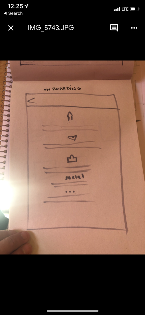
To bring our ideas to fruition we began with a Design Studio. We individually generated multiple sketches for each screen. Next, we presented our sketches to each other and identified favorable designs before going into another round of individual ideation and sketching.


Designing Wireframes
Finally, we synthesized our best ideas and moved forward into the digital wireframing process. We started with relatively low-fidelity wireframes, and as we added more detail, we brought them into High-Fidelity. We addressed all heuristic violations of the original app and polished our prioritized features.

Testing & Iteration
We conducted usability tests to detect issues with our design with input from our users. During our usability tests, we discovered that users wanted the ability to proceed without creating an account in the appointment scheduling flow. We decided to develop tutorial screens, which render upon opening the app, to explain the value of creating an account. In our final iteration, we included tutorial screens explaining account creation and in-app navigation that include permissions for notifications and location services.
Future Steps
